Marine Protected Areas
Redesign of a government website that preserves the marine protected areas
End-to-End Product Designer
4 weeks
Miro,
Figma,
Invision & Zoom
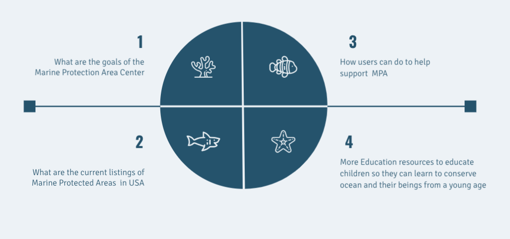
People who visit the website want to find out about :
Marine Protected Areas (MPA) are protected areas in our ocean and estuaries. MPAs restrict some human activity for conservation purposes, typically to protect natural and cultural resources.
Marine Protected Areas are important for the future because it can protect depleted, threatened, rare, and endangered species and populations. Furthermore, protecting MPA’s can help preserve habitats that are considered critical for the survival of lifecycles of species.
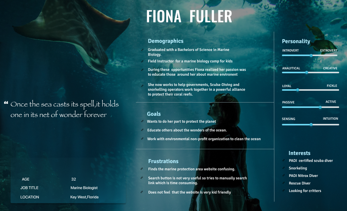
A user was created based on the common thoughts of the people who usually visit the Marine Protected Areas website.
By prioritizing test results, I was able to focus on the primary modifications and understand what my iterations would look like.
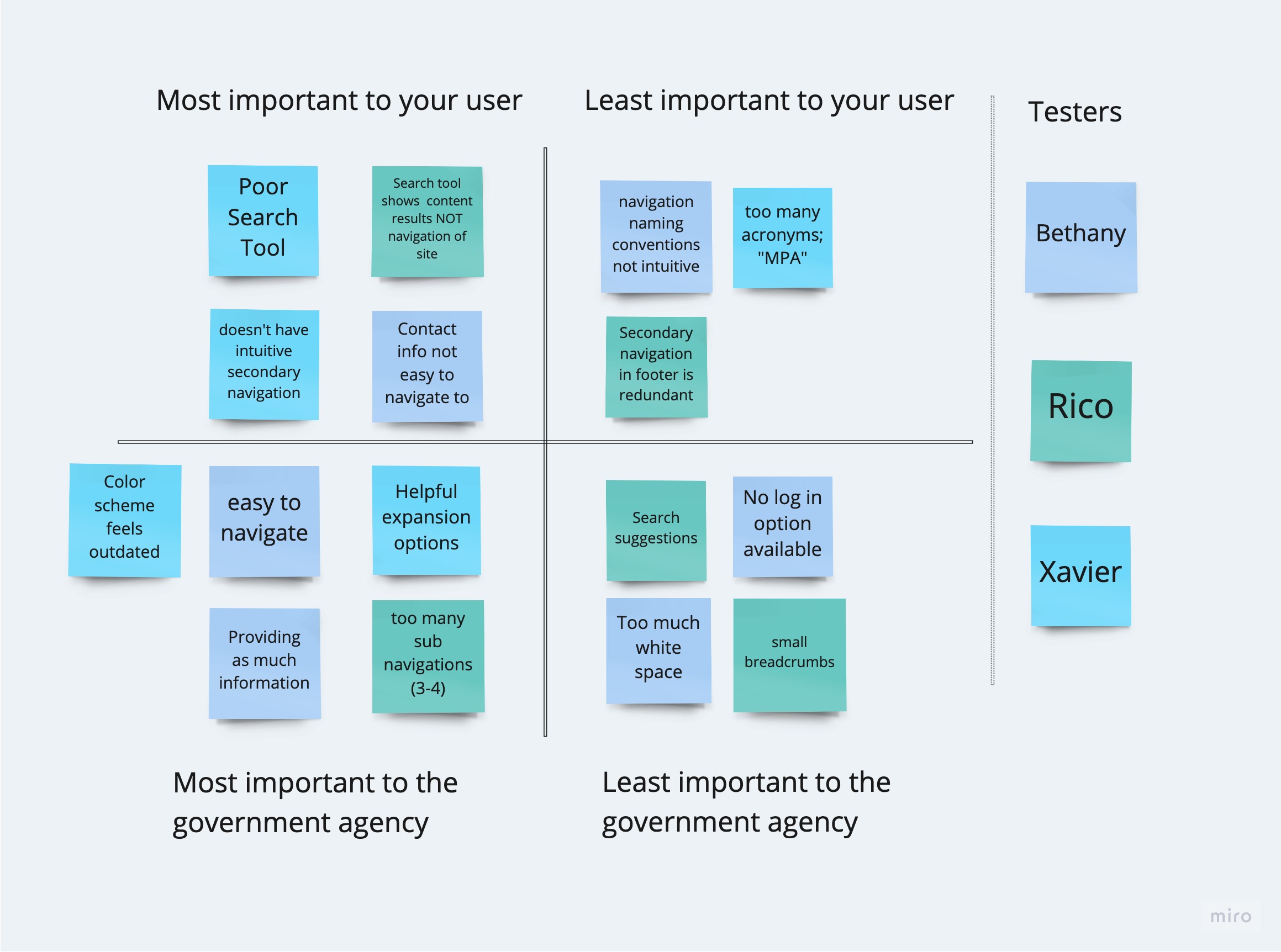
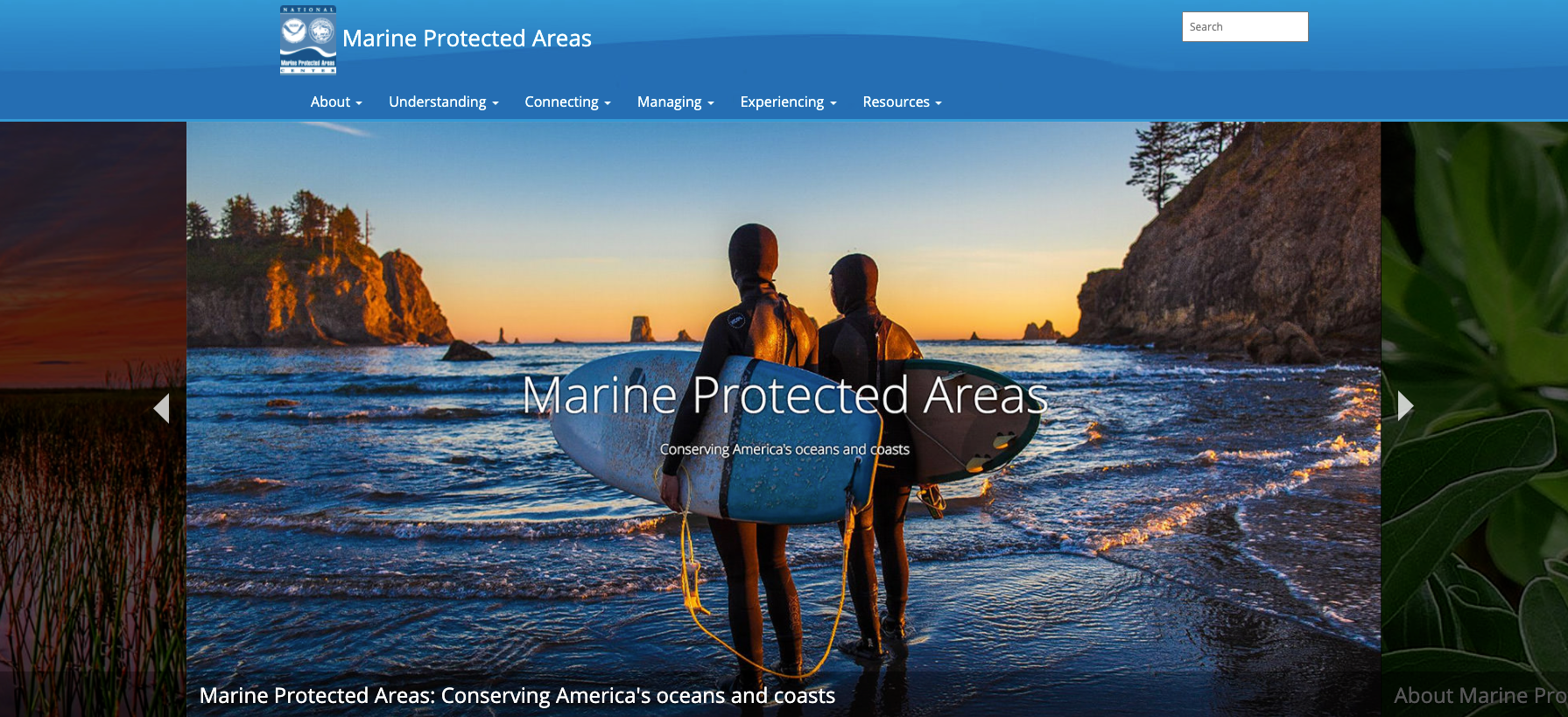
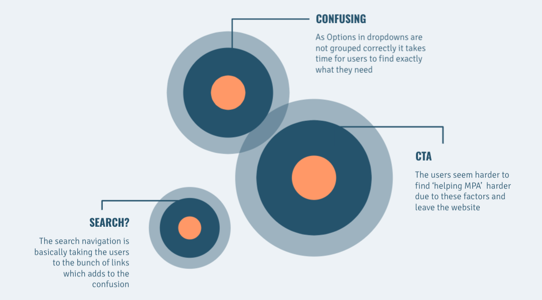
After user testing the website and analysis of the website, I found these issues that contributed to making the website non-user-friendly.
My Moodbaord consisted of mainly sea inspired photography and design.

After user testing the website and analysis of the website, I found these issues that contributed to making the website non-user friendly.

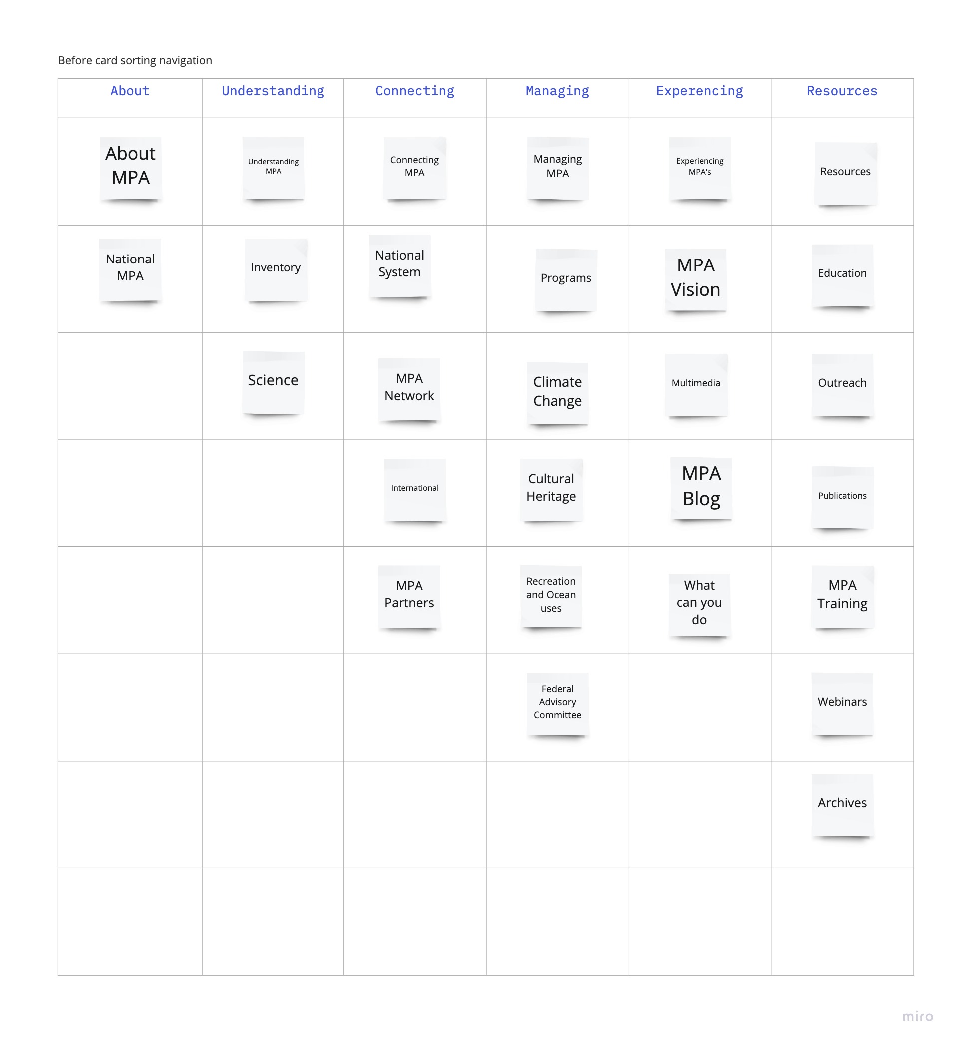
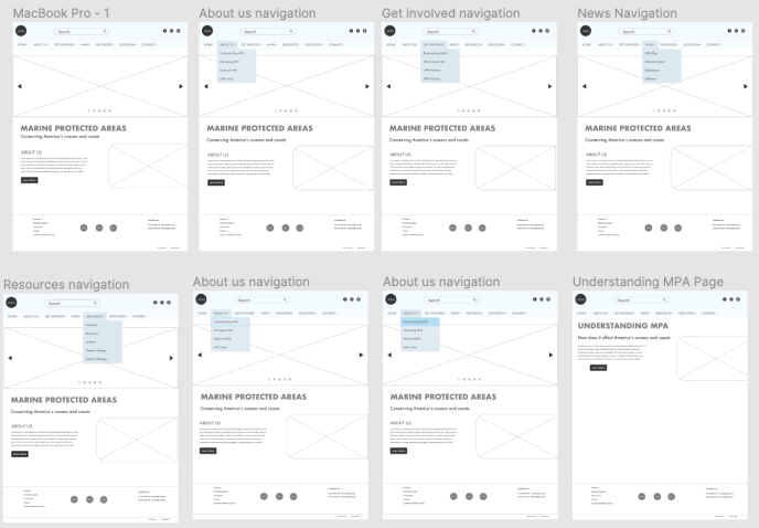
As navigation was a major pain-point I decided to solve the navigation issue using the Card Sorting technique.
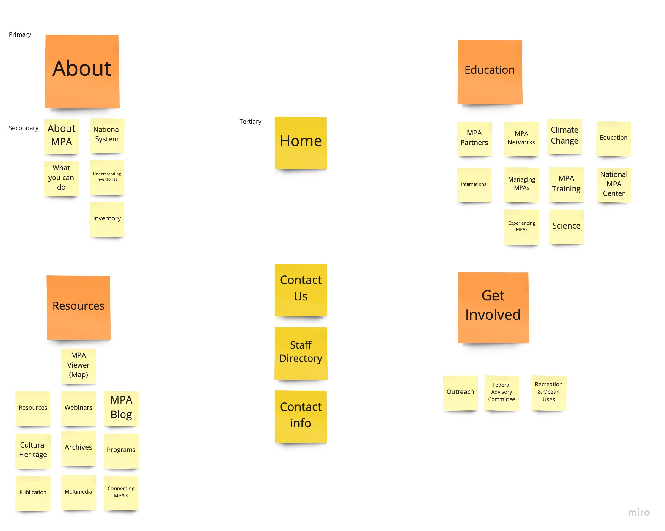
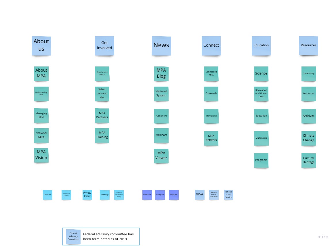
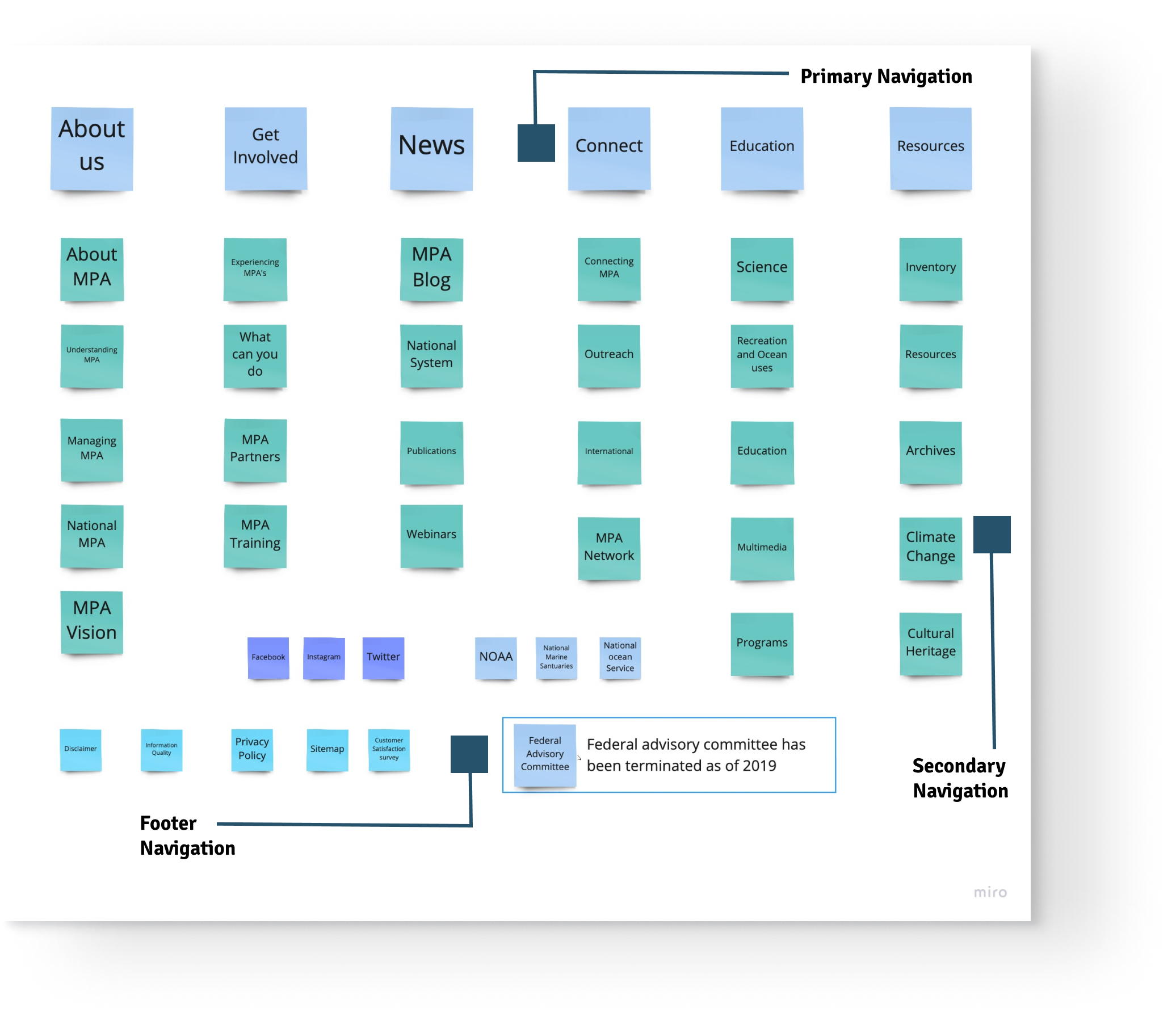
A sitemap was created based on the card sorting technique that helped to understand the navigation of the website.

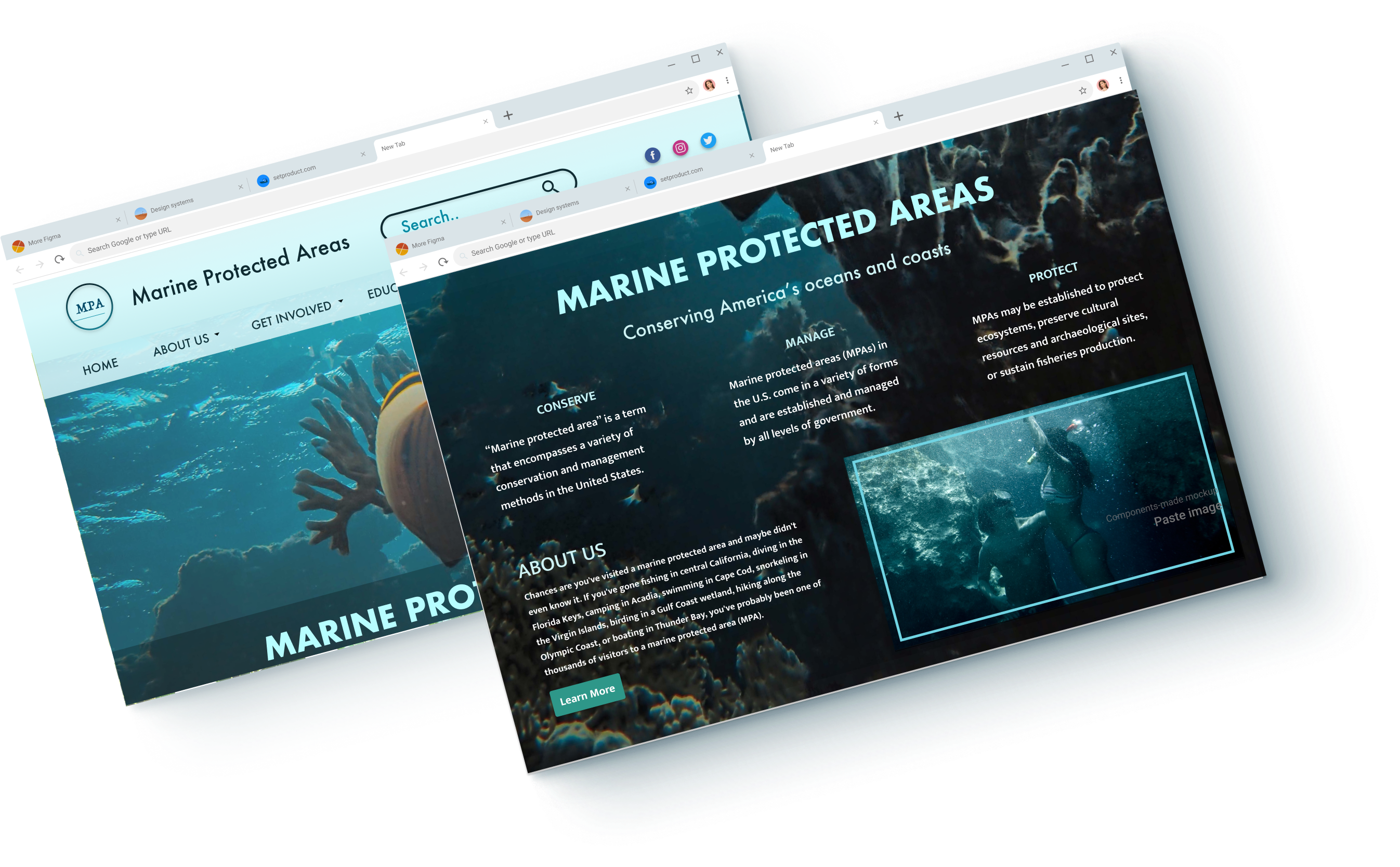
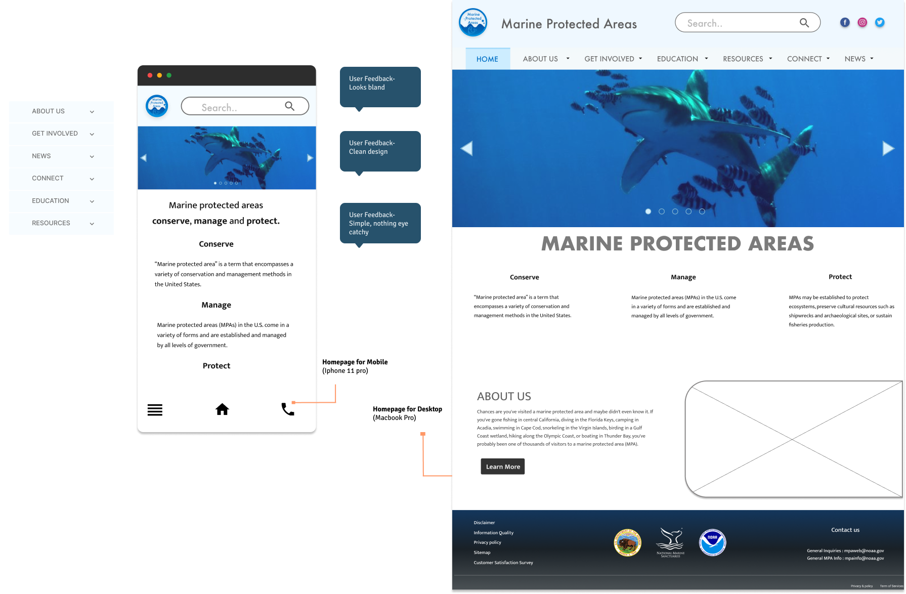
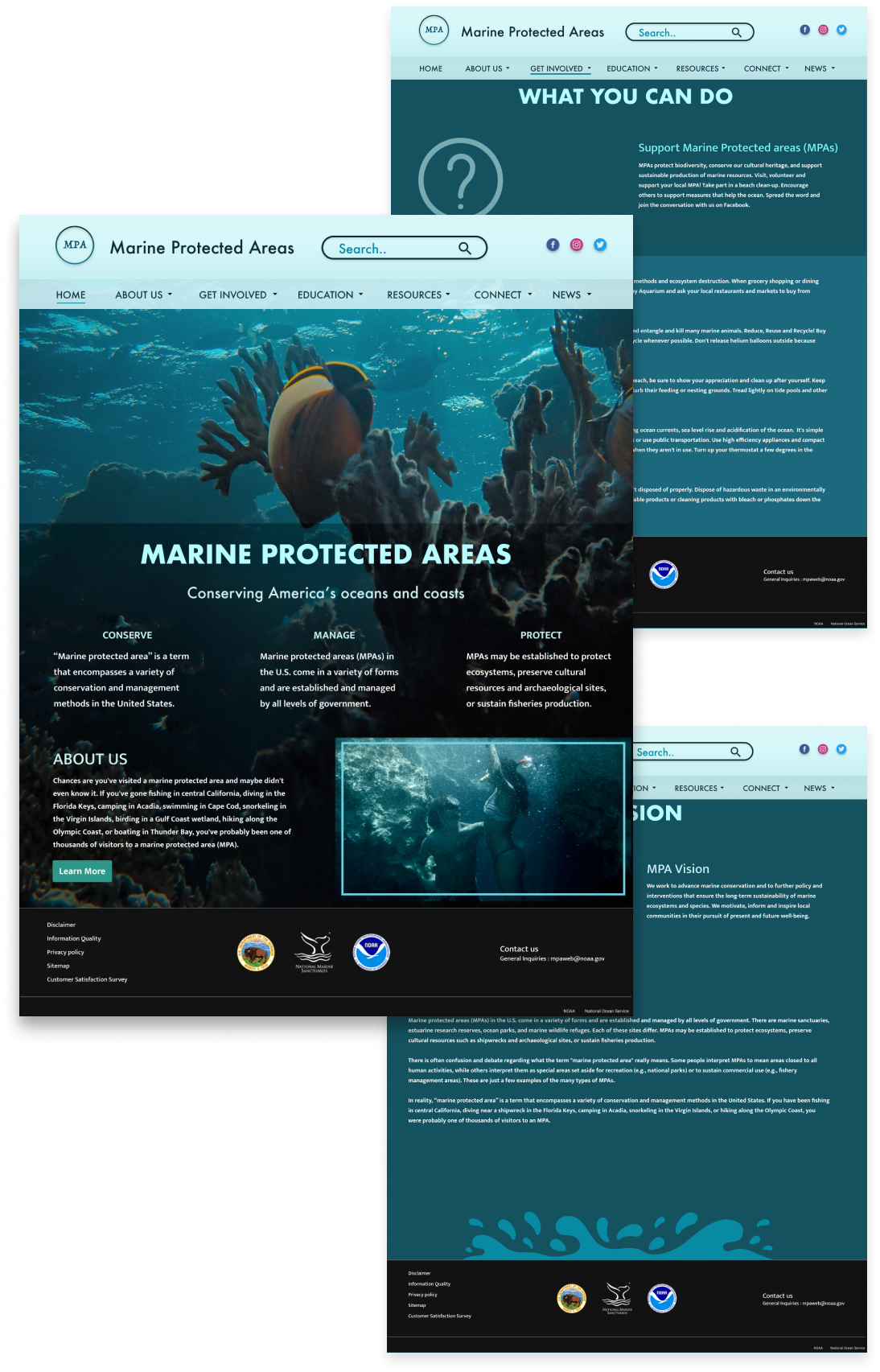
Logo- Logo contains the name of the site and waves and a fish to indicate marine life in its natural habitat
Website Name- Website name in the title
Search bar- The search bar is made an important navigation link in the redesign to find information faster rather than go through the navigation bar.
Social icons - Social icons are added to the title bar to lead visitors to social media pages and follow the content faster and lead them to promote marine protected areas onto their profiles
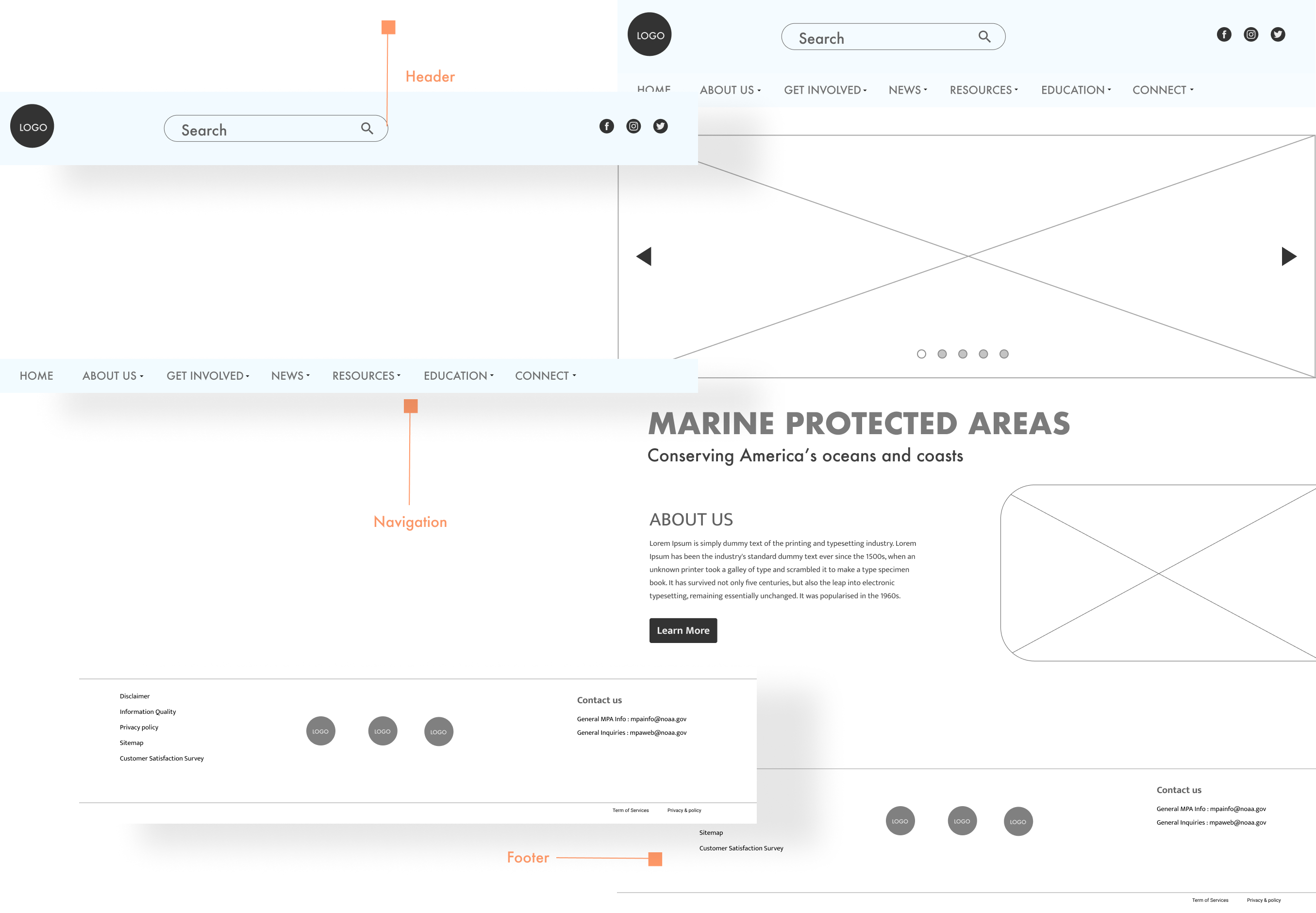
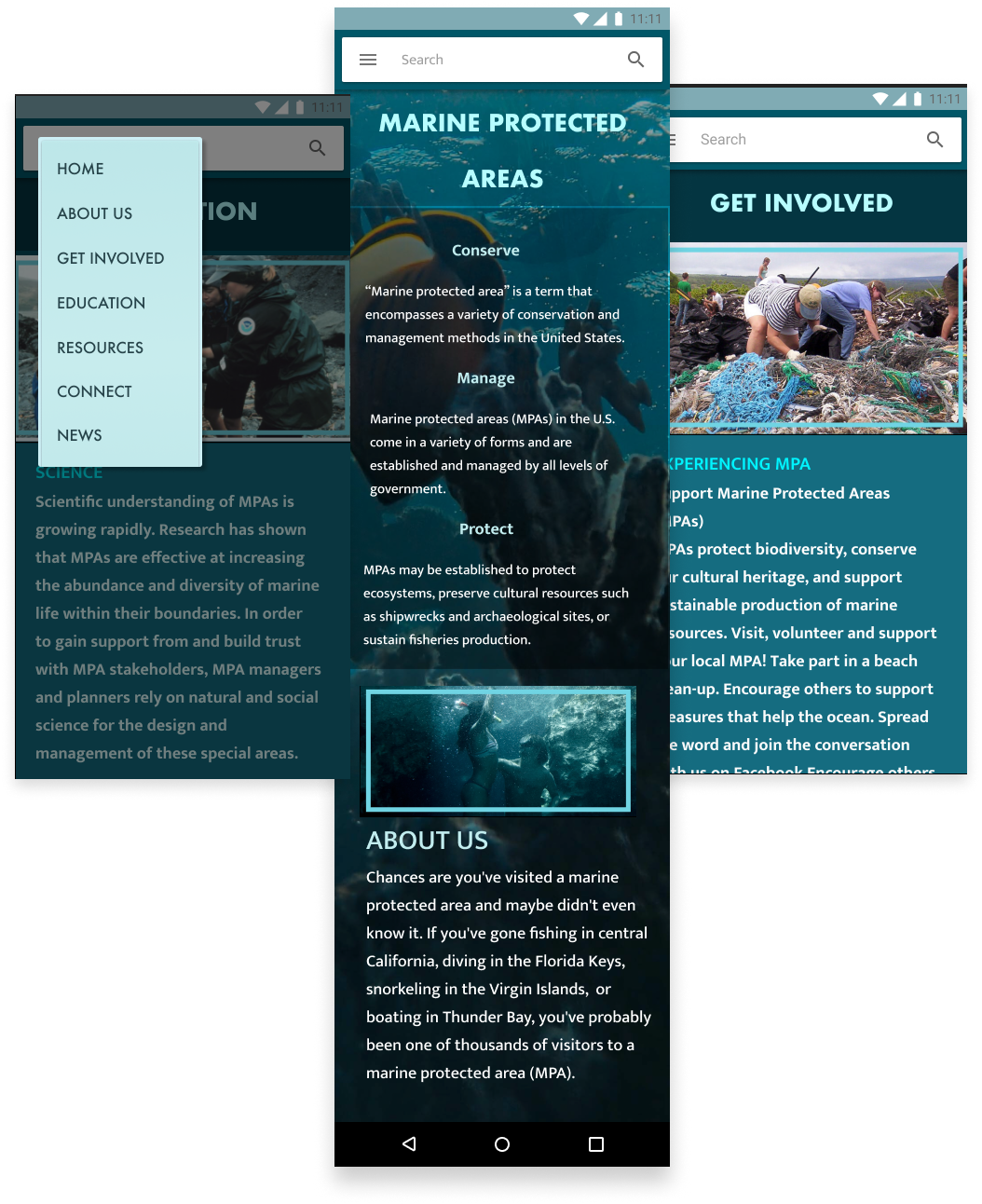
Based on the design decisions and a new sitemap, Lofi prototypes were created.
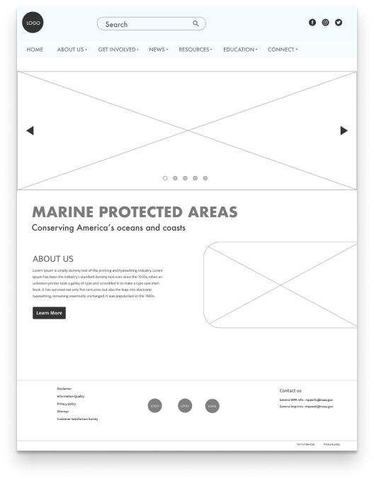
To test the design decisions I designed a minimalistic homepage similar to the Lofi and got the page tested. While few of the users thought it was simple and clean looking website, most of them found it to be boring and uninteresting.They said nothing felt eye catchy or inspiring enough to read more about Marine Protected Areas.
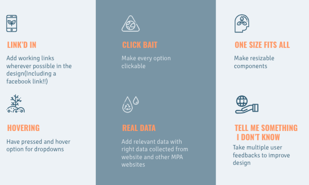
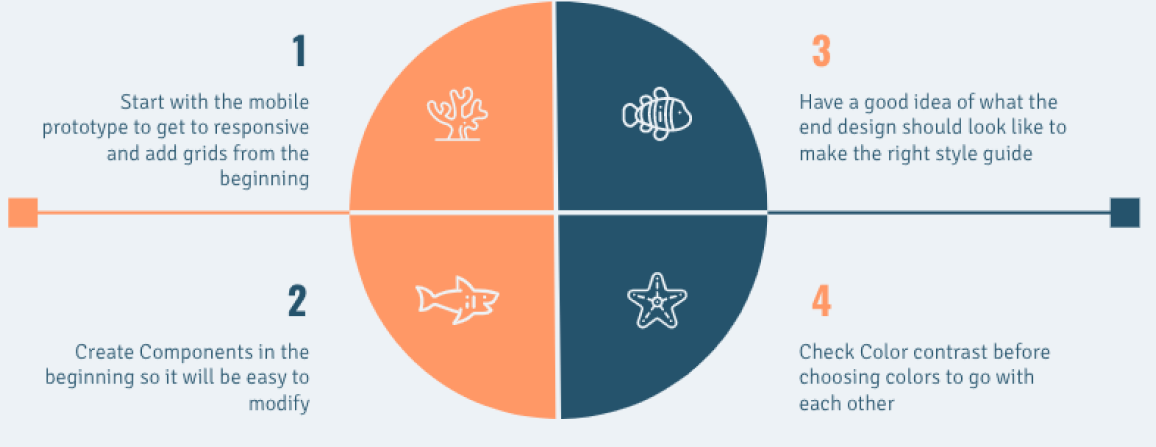
Based on the new user feedback, some changes had to be made to the style guide. A style guide was enhanced to focus on asthetics and design.Efforts were made to make it eye catchy.


In future projects, I wish to start early on the research phase and create mockups. I would want to choose a mockup design and stick with the design rather than hoping from one application to another to find ideas. I would want to include more testing .
Thank you.