Keep Kids Fire Safety Foundation
Redesigning the non-profit organization to teach fire safety to kids.

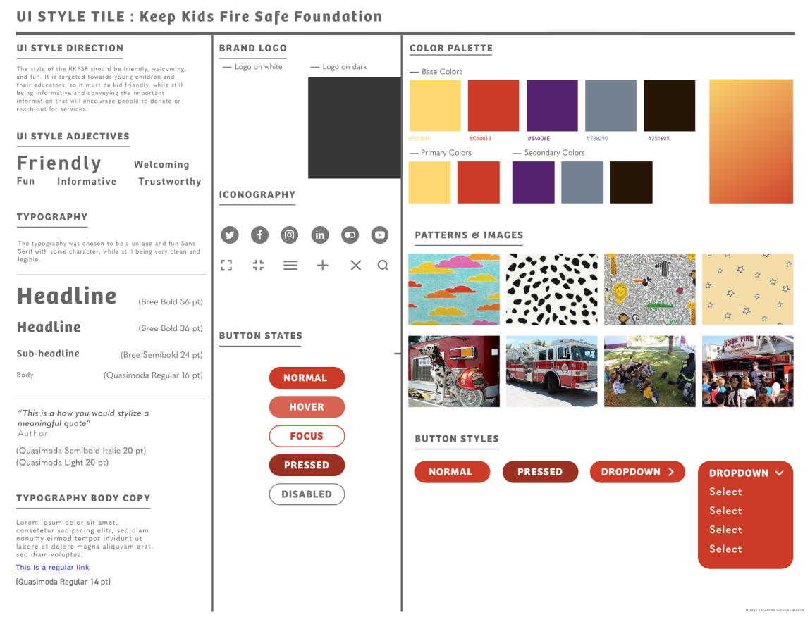
"Creating Wireframes and redesigning the resources page."
Anjali Anusuri
John Nguyen
Geri Massengale
Maya Kumaran
Miro
Figma,
Trello
& Zoom
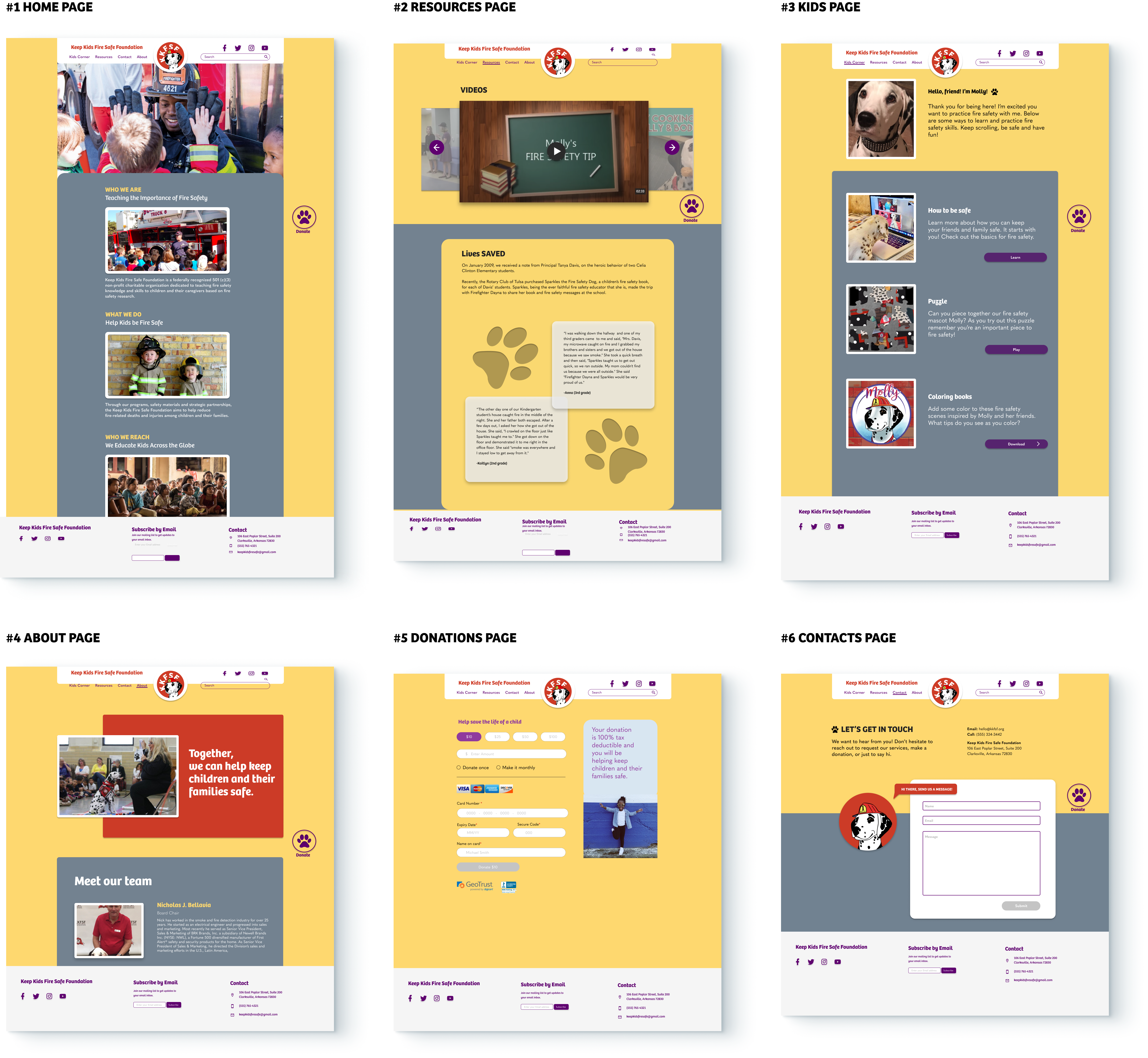
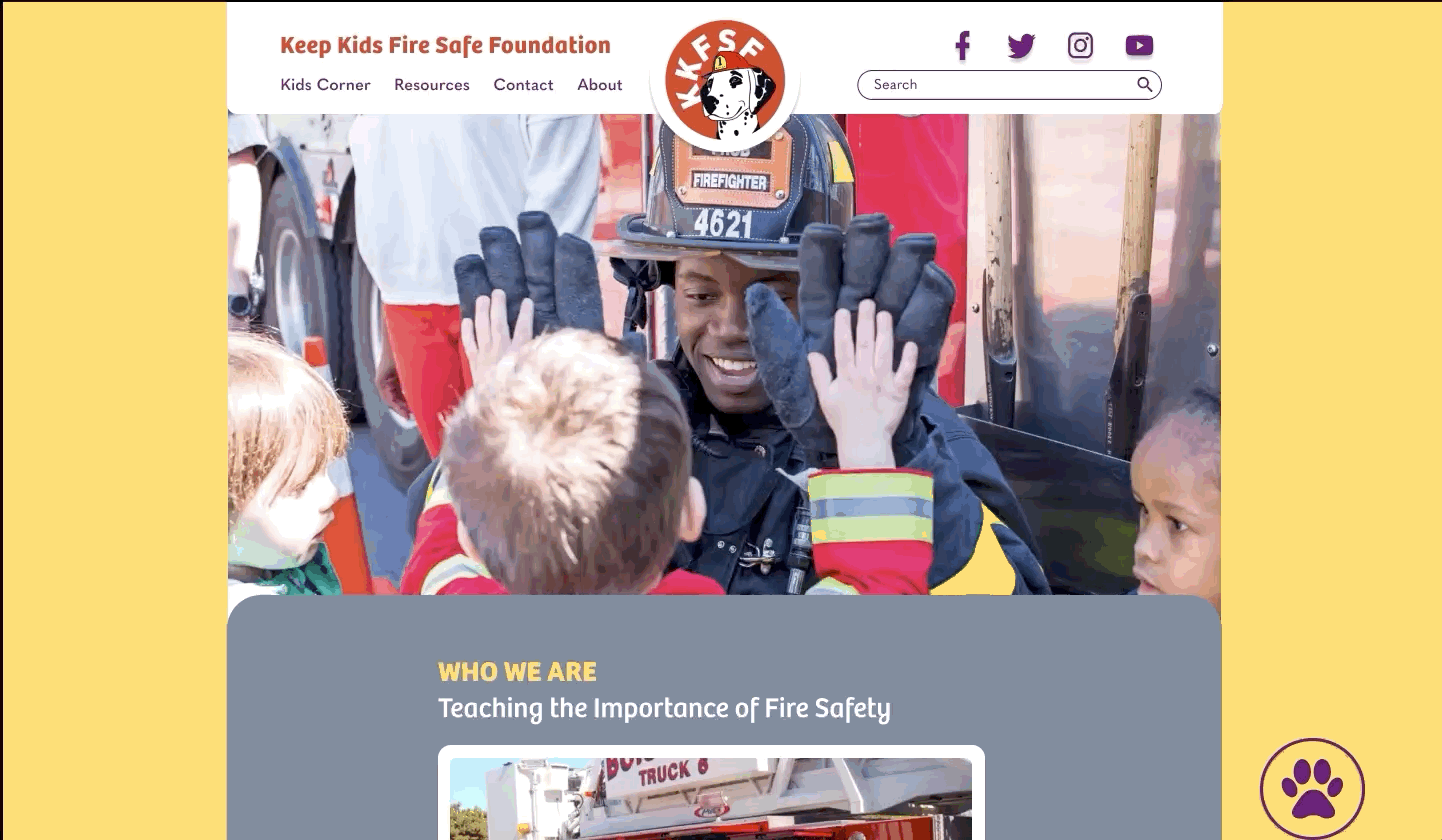
This is a redesign of a non-profit organization's website for our UI Design project.
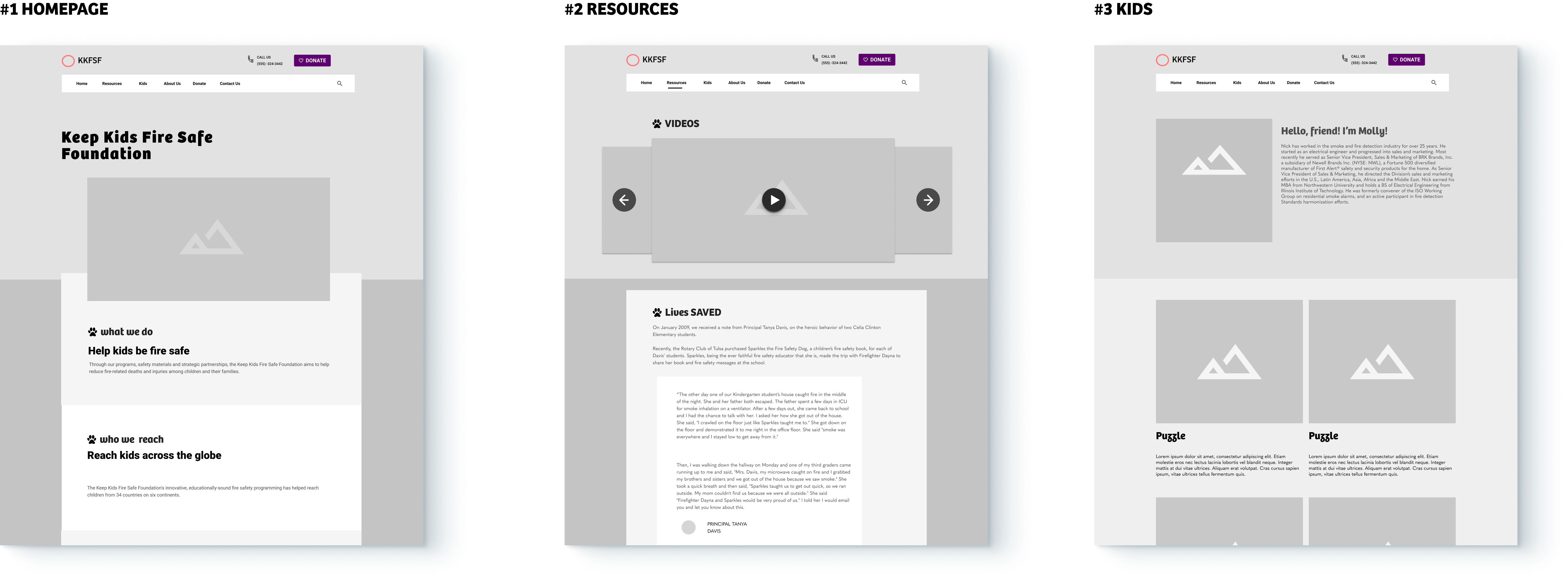
I participated in research,SWOT Analysis, wireframes of home and resources mainPage
and UI design of Resources page.
This non-profit is catered towards working with kids educating them about fire safety.K-12 Educators need an engaging and interactive way to educate young children.
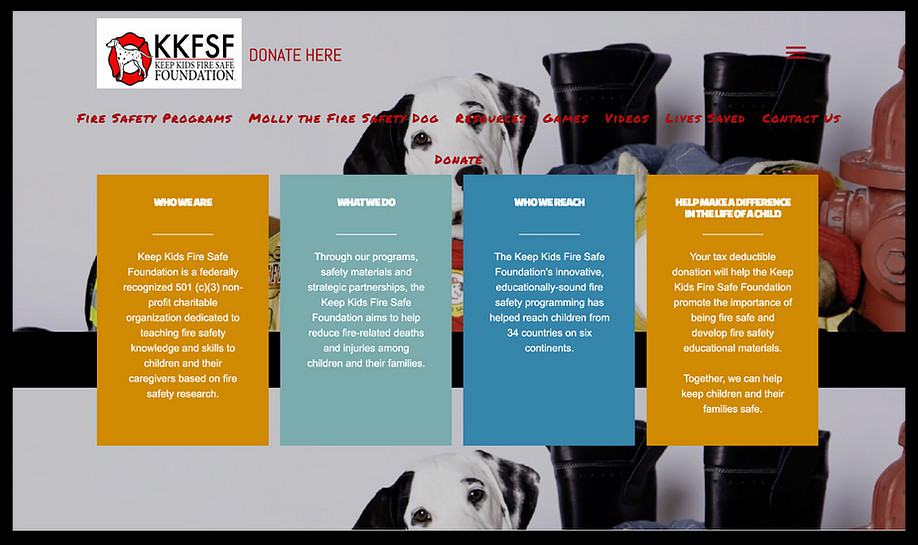
Click on the image to view the original website.

How do people discover non-profits?

Do people like donating to nonprofits?

What criteria and preferences will make people donate more?

"I hear about nonprofits through social media or word of mouth."
"I donate to a wide variety of causes that I'm personally passionate about."
"I want transparency on the website, and tend to donate more if I know who I'm donating to."
To gain a better understanding, five-user interviews were conducted regarding the pain points of the current site. After analyzing all the user interviews, a user persona was created based on the common thoughts of my interviewees.

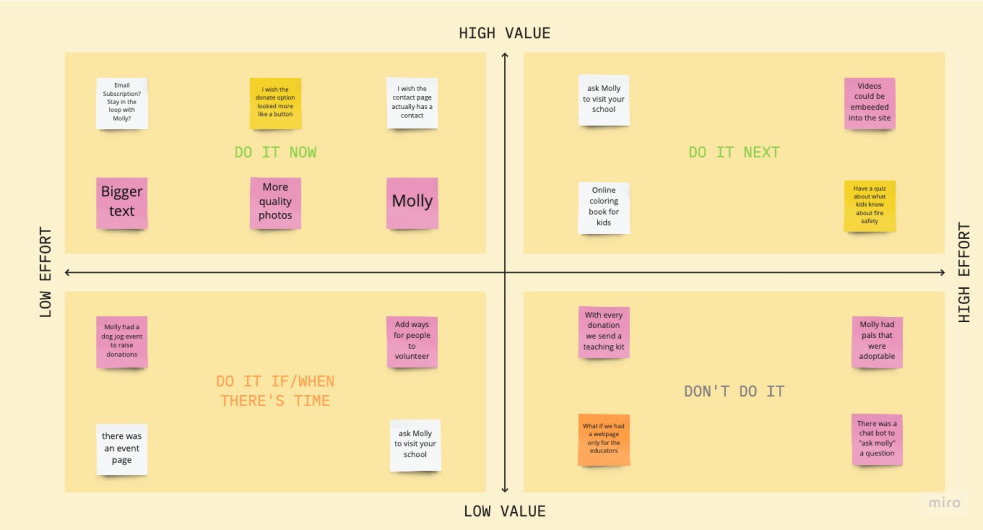
We then wanted to brain storm using I like, I wish, what if method and prioritize the features for the Non-profit using prioritization matrix.

We wanted to concentrate on rebranding and finding ways the fire safety can grow and we decided
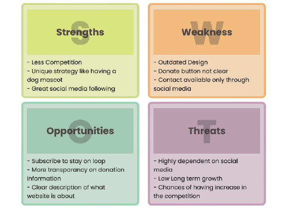
We wanted to find out the current strengths, weakness, opportunities and threats of the current website to find ways to improve.
To better explain the user's perspective with the application, a storyboard was designed.

Overall, users found the website much easier to navigate and have had no setbacks while trying to complete all tasks.
Some users had trouble navigating to the Kid’s Corner page.
Users liked the floating paw icon to donate as it was easier to find and use.
Overall It was a fun design challenge catered towards designing for a kids website, a domain I haven't explored before.Given more time, we would have tried to conduct some user tests with the kids and understand their likes/dislikes.

With more testing and stakeholder feedback, there’s more opportunity to iterate on the overall brand and look of the website.
Integrate an events page and add more ways to volunteer on the site
Generate a quiz after learning about the program and have a chatbot, and online coloring book
Sharing functionality after donating to expand reach (social media)